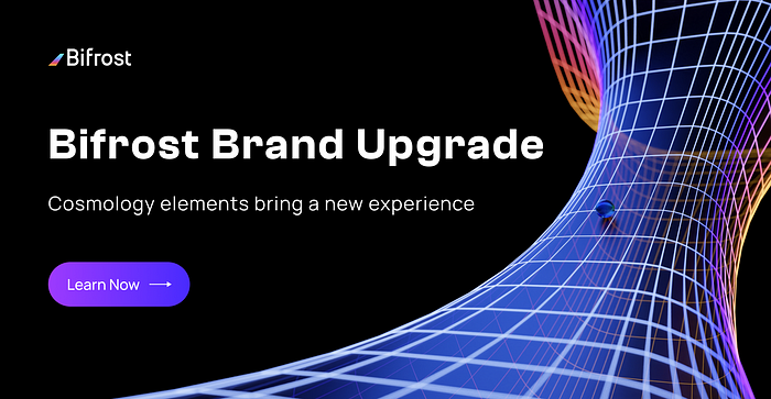
Bifrost’s New Branding and Cosmological Elements Bring an Ultimate Experience

We’ve always defined ourselves by the ability to overcome the impossible. And we count these moments. These moments when we dare to aim higher, to break barriers, to reach for the stars, to make the unknown known. We count these moments as our proudest achievements. But we lost all that. Or perhaps we’ve just forgotten that we are still pioneers. And we’ve barely begun. And that our greatest accomplishments cannot be behind us, because our destiny lies above us. — Cooper Interstellar
01 Introduction
Since its establishment in July 2019, Bifrost has grown from nothing, and gradually grows from a little bit of light. Now that Dapp has been officially launched, RoadMap is advancing steadily. Slot bidding plans for Kusama and Polkadot are also gaining momentum. Now we are very happy to be able to synchronize with our followers the latest development of the Bifrost brand upgrade that has been brewing for several months.

02 Development
At the beginning of the establishment of the brand, combining the brand’s vision and the intention of “bridge” as the main business attribute in the early stage, the brand’s logo was designed. At the same time, the early brand touchpoints were mainly based on the graphic elements of the logo.
In the stage of rapid growth, Bifrost extended the main auxiliary elements of the colour bar based on the “Bifrost”, adding vitality and stronger recognition to the brand.
In the context of more sophisticated products and technologies, Bifrost has taken a meticulous approach to the entire brand. From concept to presentation, from impression to application, all aspects have been upgraded and evolved. This brand upgrade has matured Bifrost’s brand system and looks forward to establishing a clearer and stronger brand consensus with users.
03 Concept
In Norse mythology, Bifröst /ˈbɪvrɒst/ or Bilröst is a burning rainbow bridge that reaches between Asgard, Midgard and the other realms.The gods of the Asa tribe will walk along the Bifrost to the Well of Urd next to the World Tree for a meeting every day. The bridge’s destruction during Ragnarök by the forces of Muspell is foretold.
The name Bifrost represents our vision to drive the connectivity and liquidity that underpins the building of assets in Web 3.0.
As the fairness and freedom of the early days of the internet is destroyed by the rapidly expanding giants, Bifrost looks forward to working with partners for a decentralised and fair internet. Breaking through the twilight shroud and building new Bifrost that will give users greater control over their data, identity and destiny.
Three brand keywords have been abstracted based on the background of the brand concept.

Speed
Bifrost will be at the forefront of decentralised finance with fast and efficient iterations and responses to bring users an over-the-top experience.
Flexible
Bifrost will build application scenarios and combinations of various derivatives to create a variety of usage scenarios and full liquidity for users.
Link
Bifrost will build on the Polkadot ecology, using derivatives and high-performance bridges to open up blockchain silos isolated by different consensus.
04 Standard
Graphics
The gradient ‘Bifrost’ shape and the simplicity of the Western script have been a great way of communicating the Bifrost philosophy and carrying a deep impression on users.
Therefore, instead of making radical changes to the logo, the branding process has been refined and iterated in detail to create a more abstract and mathematical relationship between the lines and shapes of the logo. The iterated logo is cleaner and more modern, and is also more compatible with different sizes and forms of media.

Colour
The colour section has been upgraded to retain the highly recognisable ‘Bifrost gradient’ and to create three secondary gradients of a warmer hue to make the gradient more comfortable to use in multiple scenarios. We have also redefined our brand’s primary colours. The original blue has been shifted towards purple and the saturation and brightness has been slightly increased to create the new ‘Dynamic Violet’. The new brand colour is more dynamic and recognisable, matching the brand’s keywords, while remaining a safe and stable colour.

Fonts
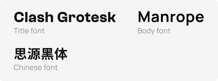
We have selected three excellent open source fonts that have undergone testing: Clash Grotesk, Manrop and Source Han Sans. A more standardised and enjoyable reading experience in a variety of typographic and application scenarios.

05 Beauty of Space
In the process of exploring expressions, we found that the cosmology-related elements, both in terms of their connotations and the intuitive feel of the intention, coincide with the key words of the newly defined Bifrost concept.
Therefore, in terms of expression, Bifrost has chosen the space of the universe as the carrier of the brand elements.

In the most distant past, there was no matter, no radiation. Even space does not exist, nor does time flow. Our story begins in a time when there was no time and no space.
Born out of space, Bifrost strives to break the limits of time and space, connecting different assets in the digital space and giving them a new lease of life.
Based on the characteristics of the cosmic space and the brand, the brand elements of Bifrost are taking shape.
Elements

WORMHOLE - Change and connection
TRANSFROM - Diversity and Inclusion
PARTICAL - Speed and Flow
FLOW PATH - Evolution and Advancement
Application
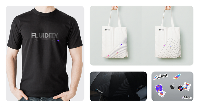
Bifrost has designed a new brand perimeter based on the new brand elements

We have also incorporated these elements into the typography of the WeChat public, upgrading the overall typography to be more clearly organised and more impressively presented.
We will later integrate the new brand elements into various application scenarios such as Bifrost Dapp and the official website to provide a more consistent and pleasant brand experience.

06 Summary
Brand design is a window to express the brand concept and build consensus with users. This exploration of brand upgrade is a step towards self-exploration and condensation, and demonstrates Bifrost’s determination to bring users a quality experience across all touchpoints, including functionality, product and brand.
As Cooper said at the beginning, “Or perhaps we’ve just forgotten that we are still pioneers. And we’ve barely begun. “. The evolutionary path of Bifrost is like a vast universe with no end.
What is Bifrost?
Bifrost is the Polkadot Ecological DeFi basic protocol. It is committed to becoming an infrastructure for staked assets to provide liquidity. Bifrost launched derivatives vToken for Staking and Polkadot Parachain Slot (Crowdloan). It has obtained $2.15M in fund-raising from NGC, SNZ, DFG, CMS and other institutions and Web3 Foundation Grant. It is also a member of Substrate Builders Program and Web3 Bootcamp.
vToken can optimize transactions in multiple scenarios such as DeFi, DApp, DEX, CEX, and realize the transfer channel of stake rights such as staking and Crowdloan through vToken, realize the risk hedging of stake assets, and expand scenarios such as vToken as collateral for lending, its staking reward part of the interest can be offset to achieve low-interest loans.
